
6 minute read · Exterior painting
Choose exterior house colours around the parts that will stay: roof, windows, stone, brick, paving and neighbouring boundaries. Test a small shortlist outside on the actual elevations, then coordinate the details. A colour that looks comfortable on an interior card can appear very different across a whole exterior wall.
There is no single palette that suits every Irish home. The useful outcome is a scheme that works with your particular materials and light, supported by a suitable coating. For an exterior painting enquiry in Dundalk, you can begin with photographs and a preferred direction before settling every colour.
Work around roof, windows and permanent materials
Make a fixed-material list before opening colour charts. Include roof tiles or slates, window and door frames, exposed brick or stone, paving and any boundary that will remain. Note whether these materials read warm, cool, dark or light in the actual setting. Do not judge their undertone from a single phone photograph.
Choose the main wall colour in relation to the largest fixed elements. Then decide whether the plinth, reveals or bands should recede or stand out. A strong contrast can define architecture, but too many separate accents can make a simple house look busy. There is no rule requiring every sill or band to be picked out.
| Fixed element | What to compare beside it | Useful test question |
|---|---|---|
| Dark slate or roof tile | Main wall lightness and undertone | Does the wall look balanced rather than glaring? |
| Warm brick or stone | Warm and neutral candidate samples | Does either sample make the retained material look awkward? |
| White or cream windows | Whites and pale colours | Is the difference between the whites intentional? |
| Dark frames | Wall contrast and door emphasis | Which element should draw attention? |
| Paving and boundaries | Plinth and garden-facing colours | Does the scheme connect at ground level? |
For a hypothetical house with warm brick at the entrance and pale window frames, test a warm neutral against a cooler pale grey. The correct choice is whichever works with the real materials and your preference, not whichever appears most often in a colour article. If both are wrong, change the shortlist rather than forcing a fashionable option.
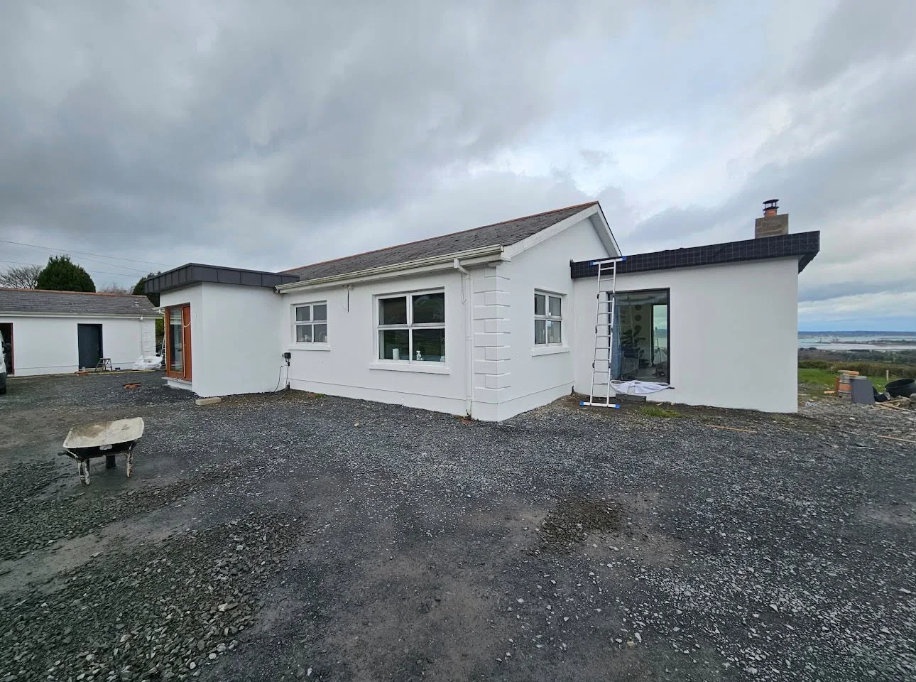
Test samples outside
Test on representative prepared sample areas or suitable movable boards, following the product's sampling guidance. Check whether a sample pot is the final exterior finish or only a colour representation. A different sheen or texture can change the appearance. Keep the exact product and colour reference with each sample.
View samples on more than one elevation. A shaded side wall can look different from the front in direct light. Look in bright and overcast conditions, and from both close range and the normal approach to the house. A tiny patch surrounded by an old strong colour can be misleading.
The Irish manufacturer Fleetwood's exterior colour article discusses changing outdoor light and colour relationships with the setting. Use it as manufacturer inspiration, not proof that a named shade suits your house or that a palette is a Dundalk trend. Its coastal setting is not assumed for every local property.
- Limit the first shortlist so differences remain understandable.
- Label each sample with product, colour and finish.
- Compare beside windows, roof-edge details and retained masonry.
- View both sunny and shaded elevations.
- Stand back to the normal street or garden viewpoint.
- Keep a written record of the final colour for each surface.
Use the general colour-sampling guide for a fuller comparison method. Avoid judging from edited images, online swatches or a photograph taken with a warm filter. A screen can suggest a direction but cannot approve a final physical match.
Coordinate doors and boundaries
Once the main wall colour is settled, compare the front door, plinth and boundary as a group. A door can be the focal point without every other detail competing. If the existing door is uPVC, composite or factory-finished, do not assume it is included in a timber-door painting plan.
A timber fence may look better related to the planting than matched exactly to the house. Read the fence colour guide for opacity, garden light and both-side decisions. A garden wall is masonry and needs a separate suitability check; matching its colour does not make its moisture conditions the same as the house.
Check what is actually changing. A new wall colour may make the old plinth appear darker or the door appear warmer. If those elements are excluded from the job, include them in the sample comparison. It is easier to accept an intentional contrast before the work than to discover it after all the main walls are painted.
Keep the colour plan separate from repair needs. A colour sample should not be used to cover a flaking or damp area before it has been assessed. Product suitability, preparation and repair readiness still determine whether the surface can be painted.
Keep inspiration separate from completed work
Reference photographs can communicate a direction, but they should be labelled as inspiration unless they show verified work by the business. A house photographed in a different country, light or material is not evidence of how the same named colour will look in Dundalk. Nor is it a completed local project.
If a photo is the starting point, describe what appeals: the wall-to-window contrast, the quiet plinth, the darker door or the relationship to planting. Those observations are more transferable than trying to copy a colour guessed from the image.
Check any planning or conservation constraints before changing a protected or sensitive property. Louth County Council's conservation information provides the local route for protected-structure queries. This guide does not decide whether a particular alteration requires permission.
Finish with a simple schedule: main walls, plinth, reveals, timber door and each separate boundary. Record the colour and product for every included surface, and mark retained elements clearly. This helps the enquiry, the quotation and future maintenance stay consistent.
Practical questions
Should the plinth always be darker than the walls?
It is an option, not a requirement. Test the relationship with paving, window frames and the house proportions. A darker band can define the base, but a strong contrast may dominate a small elevation. Judge a representative sample and record the intended boundary rather than following a fixed palette rule.
Can I approve an exterior colour from a phone image?
Use it to narrow the direction, then view a physical sample outside. Screens, camera processing, texture and light can all change the appearance. Compare the intended finish beside the permanent materials and from the normal viewing distance before treating the colour as settled.
Do all elevations have to use the same colour?
No universal rule requires it, but deliberate boundaries and the overall relationship matter. If retaining a side elevation, test the new colour beside it and consider the visible corner. Also check relevant constraints for the property before changing its external appearance. The colour plan should state each included surface clearly.
Exterior painting: discuss your surfaces and scope. Contact the team with your area and photographs.